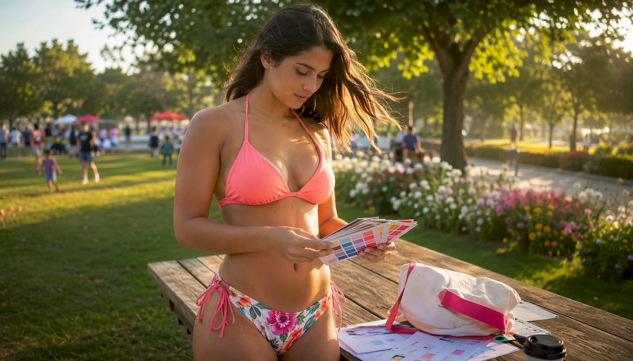
Color trends decide how a bikini reads — from safety and visibility to perceived silhouette and mood. For 2026, the dominant palettes are butter yellow, chocolate brown, powder pink, deep jewel tones, metallics, and neon accents. These shades are shaping what retailers stock, what sells fastest, and what photographs best. The role of color trends in bikinis goes well beyond aesthetics: color affects how visible you are in water, how a fabric behaves when wet, and how a look translates on camera.
Quick takeaways for shoppers:
- Neon orange or fluorescent yellow/green for open-water swimming — these colors generally improve detection in pool and lake conditions.
- Textured or double-lined white if you want the summer-white look without transparency issues.
- Contrast piping or color-blocking to define your silhouette without complex prints.
- Butter yellow or powder pink for resort and poolside looks that complement a tan and read well in photos.
Table of Contents
- How does color affect visibility and safety in water?
- What are the top 2026 bikini color trends?
- How does color behave differently across fabrics and finishes?
- How do you choose bikini colors for your skin tone and style?
- What does your color choice say about mood and occasion?
- Why are designers pushing these specific color choices for 2026?
- How do you shop color trends without wasting money?
- Key Takeaways
- The color choices that actually matter most
- Dollhousebikinis has the 2026 color palette ready to shop
- Sources and further reading
How does color affect visibility and safety in water?
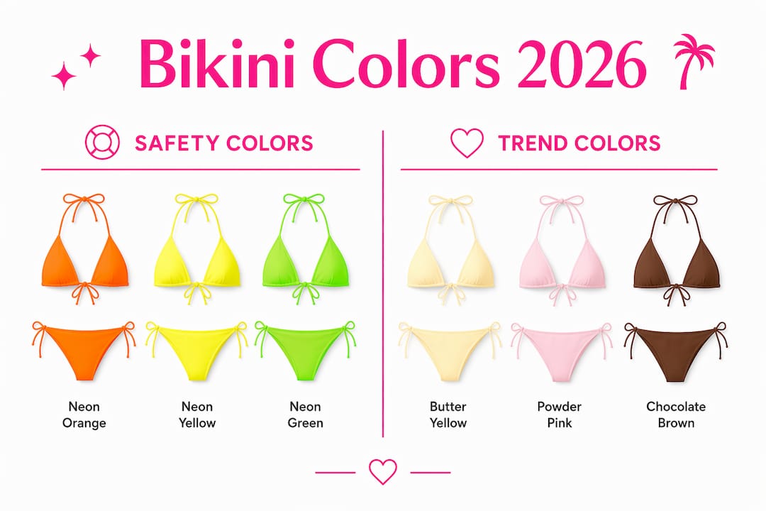
Alive Solutions’ testing found that neon orange is the most visible swimsuit color across both pool and lake conditions. Neon yellow and highlighter green follow closely. The reason comes down to fluorescent pigments: these dyes absorb UV and blue-spectrum light, then re-emit it as visible wavelengths, making the fabric appear to glow even in low-contrast water environments. Standard saturated dyes do not do this, which is why a bright cobalt blue still underperforms a neon shade in detection tests.
Water conditions change everything. Blues, grays, and black can disappear quickly in lake settings with shallow depth or agitation. Certain reds shift hue when submerged, and white can blend with foam or sandy bottoms. The practical implication: the color that looks striking on a product page may perform very differently at the beach.
Statistic: According to USA Today’s visibility roundup, neon orange, neon yellow, and highlighter greens provide the highest contrast in pool and natural water settings. Dark or muted tones can be mistaken for debris or shadows, delaying detection.
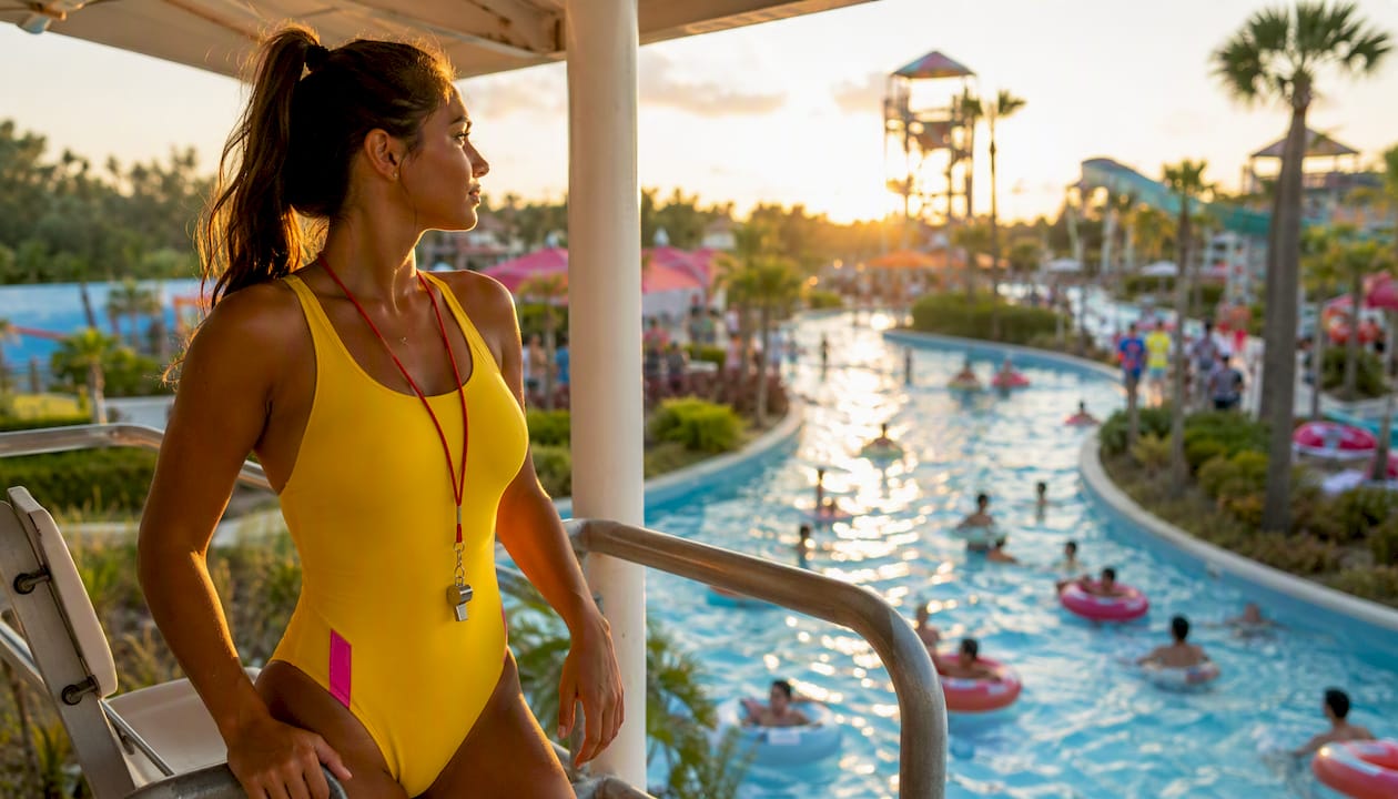
When to prioritize visibility: open-water swimming, children’s swimwear, and active surf sessions. When aesthetics can reasonably take priority: resort lounging at a supervised pool, where lifeguards and shallow water reduce risk.
Pro Tip: Bright swimwear helps lifeguards identify swimmers faster, but Lisa Zarda of the U.S. Swim School Association cautions that color is one layer of safety, not a substitute for supervision, flotation devices, or swim lessons.
What are the top 2026 bikini color trends?
Multiple 2026 trend rundowns point to the same core palettes. Here are the dominant color families, ranked by how widely they appear across resort collections and retail merchandising:
- Butter yellow — Softer than a primary yellow, this pastel shade reads warm and optimistic. It pairs with triangle tops and bandeau silhouettes, and it photographs well against bronzed skin. Vogue describes it as perfect for “basking in the warm glow of the sun.”
- Chocolate brown and earthy neutrals — Sand, clay, and deep brown are driving the quiet-luxury aesthetic. These shades work in square-neck and minimalist cuts and read expensive without being loud.
- Powder pink — Soft, feminine, and versatile. Works across skin tones and pairs easily with white or cream accessories.
- Deep jewel tones — Royal blue, deep emerald, and rich purple. These are statement colors that hold their saturation in photos and complement both fair and deep skin tones.
- Metallics and iridescents — Lurex textures, glitter fabrics, and glossy finishes are trending for poolside and resort evenings. These reflect sunlight and read glamorous in golden-hour photos.
- Neon accents — Lime green, hot orange, and fluorescent yellow are appearing as accent colors and color-blocked panels, bridging visibility and trend appeal.
Retailers are mixing long-lived neutrals with seasonal pops — a merchandising approach that helps shoppers build a small, versatile swim wardrobe rather than buying single-season pieces.
Where each palette works:
- Resort and pool lounging: Butter yellow, powder pink, chocolate brown, metallics
- Beach and surf: Jewel tones, neon accents, color-blocked solids
- Pool party: Metallics, neon, color-blocking combinations like orange and pink or blue and green
Pro Tip: Pair one trend color (butter yellow top, for example) with a neutral bottom in sand or cream. You get the seasonal look without locking yourself into a single palette for the whole summer.
How does color behave differently across fabrics and finishes?
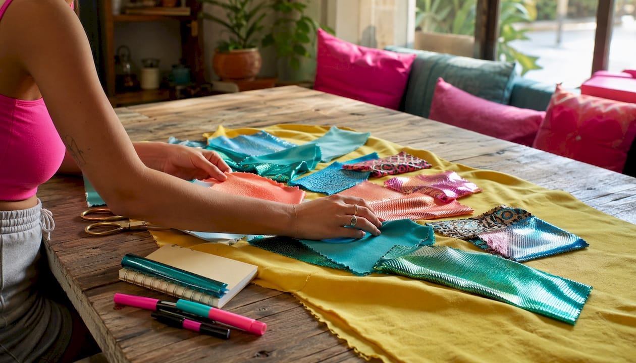
The same color reads differently depending on the fabric’s finish, texture, and dye type. This matters for both how a bikini looks in person and how it holds up after repeated sun and water exposure.
| Finish Type | Color Effect | Best For | Fade Risk |
|---|---|---|---|
| Matte | Softens intensity; reads classic and understated | Neutrals, pastels, earthy tones | Low to moderate |
| Glossy / Metallic | Amplifies richness; reflects light | Jewel tones, metallics, neons | Moderate; avoid harsh detergents |
| Textured / Ribbed | Adds depth; reduces sheerness in light shades | Whites, pastels, solids | Low; texture holds structure when wet |
| Printed / Color-blocked | Disguises wear and transparency | Any color family | Low; pattern masks fading |
Opacity is the most practical concern for light shades. White, baby pink, and pastel yellow are more prone to becoming transparent when wet, especially in unlined fabrics. Double-lined construction or a ribbed/textured weave are the reliable fixes. Check product descriptions for lining details before purchasing any pale shade.
For dark and saturated colors, the main issue is fading. Neon dyes are especially vulnerable to chlorine and UV exposure. To preserve brightness: rinse in cold water immediately after use, hand wash with a gentle detergent, and dry flat in the shade. Avoid wringing or machine drying.
Pro Tip: A glossy or metallic finish reads trendier and photographs with more impact. A matte finish ages better and reads more classic across multiple seasons. If you want one piece to work for years, matte is the safer investment. If you want one piece to dominate this summer’s photos, go glossy.
How do you choose bikini colors for your skin tone and style?
Start with your undertone, since that determines which color families will complement your complexion rather than wash it out. Three quick at-home tests:
- Jewelry test: Hold gold and silver jewelry against your wrist. Gold flattering = warm undertone. Silver flattering = cool undertone. Both work = neutral.
- Vein check: Look at the veins on your inner wrist in natural light. Green or olive = warm. Blue or purple = cool. Both = neutral.
- White paper test: Hold a white sheet next to your face. If your skin looks yellowish, you’re warm. If it looks pinkish or bluish, you’re cool.
Once you know your undertone, color selection becomes more direct. For more detail on matching shades to your complexion, the best bikini colors for your skin tone guide covers this in full.
Color placement and perceived proportions:
- Bright or light colors on top draw the eye upward, adding visual emphasis to the shoulders and neckline.
- Dark bottoms visually minimize the hip area.
- Contrast piping or trim at the waist defines the midsection without requiring a complex print.
- Color-blocked panels can elongate the torso when placed vertically.
2026 colors by skin tone:
- Warm undertones: butter yellow, chocolate brown, coral, metallic gold, earthy olive
- Cool undertones: powder pink, deep jewel tones (royal blue, deep purple), silver metallics, classic black
- Neutral undertones: most 2026 palettes work; neon accents and color-blocking are especially flexible
For tan skin, deep jewel tones and neons pop with high contrast. For lighter or untanned skin, butter yellow and powder pink tend to complement without overpowering. Understanding how color flatters your skin tone applies across categories, not just swimwear.
Quick color guide by style goal:
- Photogenic: Butter yellow, neon accents, metallics, jewel tones
- Minimalist: Chocolate brown, sand, cream, classic black
- High-visibility: Neon orange, fluorescent yellow/green, hot pink
- Versatile/mix-and-match: Neutral base (sand, black, white) plus one trend accent
What does your color choice say about mood and occasion?
Color psychology in swimwear is straightforward: the shade you pick signals your energy level, the occasion, and how you want to read in photos. Neon shades communicate active and playful. Butter yellow reads sunny and relaxed. Deep brown or black signals sophistication and minimalism. Metallics say evening-ready, even poolside.
Photo performance by color:
- Bright sun: Neons and jewel tones hold saturation. Pastels can wash out in harsh midday light.
- Golden hour: Butter yellow, coral, and metallics photograph exceptionally well. The warm light amplifies these shades.
- Social media feeds: High-contrast colors (neon, jewel tones, color-blocking) perform better as thumbnails. Neutrals read more editorial.
Color-blocking and contrast piping are the most direct tools for creating focal points. A black bikini with white trim draws the eye to the silhouette’s outline. An orange-and-pink color-blocked set creates visual energy without a print. These techniques work both in person and on camera because they give the eye a clear path to follow.
Occasion mapping:
- Pool party: Neons, metallics, color-blocking
- Resort lounging: Butter yellow, powder pink, chocolate brown
- Beach and surf: Jewel tones, neon accents, sporty color-blocked solids
- Evening poolside: Metallics, deep jewel tones, classic black with gold hardware
Why are designers pushing these specific color choices for 2026?
The 2026 palette did not appear randomly. Designers are responding to a post-pandemic appetite for warmth, optimism, and sensory richness — and color is the fastest way to deliver that at retail.
“Swimwear is an emotional purchase that awakens memories — color choices often aim to complement mood and vacation tan rather than just follow runway color alone.”
— Maria Sinkovskiy, as cited by Who What Wear
That framing explains why butter yellow and powder pink dominate: they are warm, memory-adjacent shades that feel like vacation before you even leave home. Jewel tones and metallics serve a different function — they photograph with high impact and translate well to social media, which has become a primary driver of swimwear purchasing decisions.
Harper’s Bazaar’s 2026 swimsuit trend coverage highlights how designers use color placement, not just color choice, as an architectural tool. Contrast trims and piping define silhouette on solid suits. Textured fabrics update summer-white looks without requiring a print. These are deliberate decisions about where color lands on the body, not just which color to use.
Dollhousebikinis interprets these palettes with attention to lining, finish, and photography-ready construction. The 2026 trend collection reflects the same color families the runway is pushing, with practical details like double lining in light shades and contrast trim options that work across body types.
How do you shop color trends without wasting money?
The most common mistake: buying a trend color in a silhouette that does not fit well. Color is the second decision, not the first.
Shopping checklist:
- Confirm silhouette and fit before committing to a color.
- Check the lining details in the product description, especially for white, pastel yellow, and powder pink.
- View the product in multiple lighting conditions if possible — or check if the retailer shows both studio and outdoor photos.
- Confirm the return policy before purchasing a bold or neon shade you have not worn before.
- For neon pieces, check fabric care instructions upfront. Chlorine and UV exposure fade these dyes faster than standard colors.
The 3-color rule for a swim capsule:
- One neutral base (black, sand, chocolate brown, or white) — this is your workhorse piece. It pairs with everything.
- One 2026 trend color (butter yellow, jewel tone, or metallic) — this is your statement piece for the season.
- One accent or neon — a single neon top or color-blocked bottom adds versatility and visibility without committing your whole wardrobe to a trend.
Mix-and-match in practice: a sand-colored bottom pairs with a butter yellow top for resort, then with a neon orange top for open-water days. The neutral bottom does the work across both looks. Retailers are merchandising color-blocked basics plus one statement color per capsule for exactly this reason — it reduces buyer’s remorse and increases per-customer spend over a season.
For a full step-by-step buying approach, the trendy swimwear buying guide covers fit, fabric, and color selection in sequence.
Key Takeaways
Color trends shape bikini visibility, silhouette, and buying decisions — and the 2026 palette of butter yellow, jewel tones, metallics, and neons gives shoppers both style options and practical safety choices.
| Point | Details |
|---|---|
| Neon colors are safest in open water | Neon orange, yellow, and green are the most visible colors in pool and lake conditions. |
| Light shades need lining | White, pastel yellow, and powder pink can become sheer when wet; double lining or textured fabric prevents this. |
| 2026 key palettes | Butter yellow, chocolate brown, powder pink, jewel tones, metallics, and neon accents dominate this season. |
| Use the 3-color rule | Build a swim capsule with one neutral, one trend color, and one neon or accent for maximum versatility. |
| Dollhousebikinis for 2026 trends | The collection covers the full 2026 palette with double-lined light shades and contrast-trim options. |
The color choices that actually matter most
Most trend coverage focuses on which colors are popular. The more useful question is which colors are doing real work — for visibility, for flattery, and for longevity in your wardrobe.
The conventional wisdom says to follow the runway. The more practical view: start with the safety and fabric behavior questions first, then layer trend choices on top. A butter yellow bikini that goes sheer at the beach is a worse purchase than a well-lined powder pink one, regardless of which shade is more on-trend this week.
The 2026 palettes are genuinely strong. Butter yellow and chocolate brown are flattering across a wide range of skin tones. Jewel tones photograph well in almost any light. Metallics have enough novelty to feel current without being so specific that they date quickly. Neons serve double duty: they are trend-forward and functionally safer in open water.
One thing worth noting: color-blocking and contrast piping are doing more design work this season than large prints. That is a practical advantage for shoppers. A solid suit with contrast trim is easier to mix and match, easier to care for, and tends to hold its look longer than a busy print that fades unevenly.
Dollhousebikinis has the 2026 color palette ready to shop
The 2026 trend colors are all available at Dollhousebikinis, with construction details that match the practical guidance in this article. Light shades come double-lined. Contrast-trim options are available across silhouettes. The two-piece set collection covers butter yellow, jewel tones, and neon accents in mix-and-match separates, so you can build the 3-color capsule without buying multiple full sets.
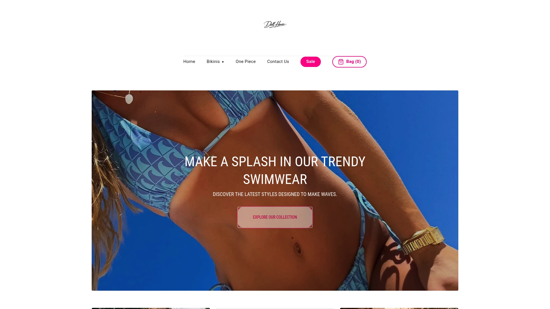
The Kelly three-piece swimsuit is a strong option for shoppers who want a trend-forward color with built-in versatility. For a foundational piece in a classic silhouette, the core swimsuit covers the neutral base your capsule needs. Orders over $100 ship free. Check the lining details on each product page before purchasing a light shade, and confirm the return policy if you are trying a new color for the first time.
Sources and further reading
- Popular Science — “What’s the safest swimsuit color? Skip blue and black.” — Primary source for Alive Solutions’ visibility testing, fluorescent pigment science, and Lisa Zarda’s safety commentary. Supports the visibility and safety section.
- BBC Future — “How the colour of your swimsuit can save your life” — Explains how water conditions (depth, agitation, bottom color) change how colors appear underwater. Supports the physics discussion in the visibility section.
- USA Today — “The best swimsuit colors for visibility” — Confirms neon orange, yellow, and highlighter green as top-visibility colors; notes that dark tones can be mistaken for debris. Supports the statistic callout.
- Who What Wear — Bikini colour trends 2026 — Primary trend source for 2026 palettes and Maria Sinkovskiy’s designer commentary on color as an emotional purchase. Supports the trend palette and designer perspective sections.
- Harper’s Bazaar — “Swimsuit Trends 2026: 10 Swimwear Styles Defining the Season” — Documents contrast trims, piping, and textured fabrics as the season’s key design tools. Supports the fabric/finish and designer perspective sections.
- Vogue — “The 2026 Swimsuit Trends We Can’t Wait to Dive Into” — Covers minimalist earthy palettes, butter yellow, retro silhouettes, and color-blocking. Supports the trend palette section.
- Dollhousebikinis — Summer 2026 Bikini Trends — In-house trend report covering 2026 palettes and retail merchandising approach. Supports the shopping guidance and promo sections.
Recommended
- How to Buy Trendy Bikinis: A Step-by-Step Guide for 2026 | News - Doll House
- Trendy swimwear styles: Examples, tips, and buying guide | News - Doll House
- Summer 2026 Bikini Trends: What’s Hot in Swimwear Fashion | Doll House
- Why bikinis are popular: style, trends, and social influence | News - Doll House