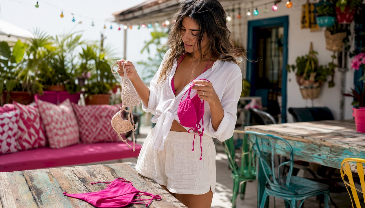
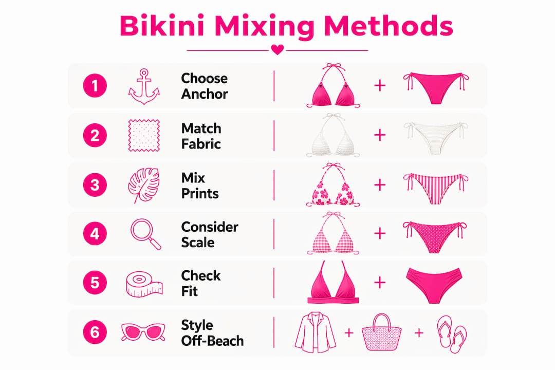
Four principles guide every bikini set mixing method: use a color anchor, keep one piece as the hero, contrast scale, and match fabric behavior. Applying these creates a consistently intentional look.
- Color anchor: Pull a solid bottom in one accent shade from a printed top. The eye reads the two pieces as a set.
- One hero piece: When one piece is bold (large print, metallic, cutout), keep the other understated. Visual competition kills a look.
- Scale contrast: Pair a large-scale print with a smaller-scale print or a solid. Same-scale prints fight each other.
- Match fabric behavior: Pair pieces with similar stretch and recovery so they move, dry, and sit the same way on the body.
Three ready-to-wear combos to copy right now:
- Floral print top (large bloom) + coral solid high-waist bottom (pulls the coral from the print)
- Wide stripe top + micro-dot bottom in the same color family
- Ribbed solid top + metallic sheen bottom (texture swap, one color family)
In-store shortcut: hold the two pieces at arm’s length. If one clearly leads and the other supports, the combo works.
Table of Contents
- What are the best bikini set mixing methods to use?
- How do you mix prints with solids for a cohesive look?
- Why do large and small prints work together, and what mistakes should you avoid?
- Which texture pairings look high-end without using prints?
- How do you mix bikini sizes so the fit actually flatters?
- How do you style a mixed bikini set off the beach?
- What do stylists say about mixing bikini sets, and what does Doll House recommend?
- What should you look for when building a mix-and-match bikini wardrobe?
- How do you choose bikini pieces based on body shape?
- How do seasonal trends affect bikini set mixing?
- How do you coordinate bikini colors with your skin tone?
- Which mixing approach works best for each occasion?
- Key Takeaways
- Why mix-and-match bikinis are worth building into your wardrobe
- Dollhousebikinis has the pieces to make mixing easy
- Further reading and sources
What are the best bikini set mixing methods to use?
Eight named methods cover most situations. Each one starts with a decision, adds a second piece, and produces a specific result.
- Solid anchor + print. Pick a solid in a neutral or accent color first. Add a printed piece that contains that color. Works for any occasion.
- Tonal family mix. Stay inside one color family (all warm, all cool). Mix any prints or textures freely within it. Reliable for resort and travel looks.
- Scale contrast. Choose a large-scale print (big florals, wide stripes). Pair with a small-scale print (micro dots, thin stripes) in the same palette. The scale contrast prevents visual competition.
- Texture swap. Stay in one color. Switch texture: ribbed top with smooth matte bottom, crinkle fabric with metallic sheen. Adds depth without pattern.
- Color blocking. Pick two colors that sit opposite on the color wheel (coral + teal, cobalt + yellow). Use one per piece. Keep both pieces simple in cut.
- Hardware match. Match metal hardware (rings, clasps, chains) across top and bottom. Unifies mismatched prints or colors through a single repeated detail.
- Coverage swap. Pair a minimal-coverage top (triangle, bandeau) with a higher-coverage bottom (high-waist, boy short), or reverse. Balances the silhouette.
- Size-specific pairing. Size the top to the bust and the bottom to the hips independently. Covered in detail in the fit section below.
| Method | Best occasion | Fabric note |
|---|---|---|
| Solid anchor + print | Pool, everyday | Any; match stretch level |
| Tonal family mix | Resort, travel | Works across textures |
| Scale contrast | Photo, beach | Keep palette consistent |
| Texture swap | Resort, evening pool | Match thickness and recovery |
| Color blocking | Pool party, active beach | Avoid busy cuts |
| Hardware match | Resort, photo | Metal tone must be identical |
| Coverage swap | Active beach, family pool | Check waistband stretch |
| Size-specific pairing | All occasions | Size each piece independently |
How do you mix prints with solids for a cohesive look?
Pick a color anchor from the print first, then match a solid to that exact shade. That single step does most of the work.
Steps:
- Identify the two or three accent colors in the printed piece.
- Choose a solid that matches one accent, not the dominant background color. Matching the accent creates contrast; matching the background makes the look flat.
- Balance hardware: if the print has gold details, choose a solid with gold hardware to close the loop.
Three realistic combos:
- Floral top + coral high-waist bottom. The floral contains coral blooms. The solid bottom pulls that coral. The large bloom reads as the hero; the solid supports.
- Stripe top + navy solid bottom. Wide horizontal stripes with navy as one stripe color. Navy solid bottom grounds the look and lengthens the torso.
- Animal print top + black bottom. The animal print is the hero. Black is the anchor. Neutrals like black and navy work as foolproof anchors for almost any print.
Pro Tip: When in doubt, go neutral. A black, white, sand, or navy solid bottom pairs with virtually any printed top in your wardrobe. Build your solid collection in these four shades first.
Why do large and small prints work together, and what mistakes should you avoid?
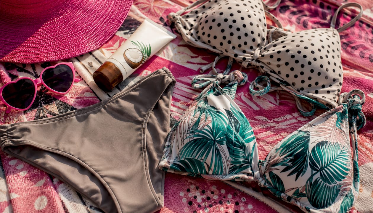
Pair one large-scale print with a smaller-scale print and keep at least one shared color between them. That combination prevents visual competition because the eye has a clear focal point.
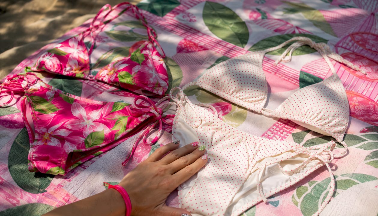
Why it works: Scale contrast gives each piece a role. The large print leads; the small print supports. When both prints are the same scale, neither leads and the look reads as busy.
How to judge scale in real life: Hold the piece at arm’s length. If the repeat is bigger than your palm, it is large-scale. Smaller than your palm is small-scale. A repeat the same size as your palm is medium and can pair with either.
Do’s and Don’ts:
- Do keep at least one color consistent across both prints.
- Do let the larger print sit on whichever piece you want to draw attention to.
- Don’t pair two large-scale prints of the same repeat size.
- Don’t mix prints from opposite color families (warm and cool) without a neutral anchor piece.
Before/after corrections:
- Before: Wide tropical floral top + large leopard bottom (same scale, clashing palettes). After: Wide tropical floral top + micro leopard bottom in the same warm tones.
- Before: Bold stripe top + bold plaid bottom (same scale, competing geometry). After: Bold stripe top + thin pinstripe bottom in one shared color.
Which texture pairings look high-end without using prints?
Swap texture instead of pattern to add depth while staying in one color family. The result reads as intentional and polished.
Texture pairings that reliably work:
- Ribbed + smooth matte. The ribbed piece has visual weight; the matte piece recedes. Both stay in the same color.
- Crinkle + metallic sheen. The crinkle fabric is casual; the metallic sheen elevates it. Keep both in the same warm or cool tone.
- Smocked + matte. Smocking adds texture at the bust or waist; a flat matte bottom keeps the lower half clean.
Fabric behavior checks matter here. Match stretch and recovery across pieces so they move the same way when wet. A high-stretch ribbed top paired with a stiff woven bottom will gap and shift differently in water. Also check thickness: a sheer crinkle fabric next to an opaque matte piece can look unfinished. Line the sheer piece or choose a crinkle with more body.
Pro Tip: Test texture compatibility at home. Wet both pieces in the sink and stretch them side by side. If one stretches significantly more than the other, they will behave differently on the body. A quick wet test also reveals unexpected sheerness before you’re at the pool.
How do you mix bikini sizes so the fit actually flatters?
Size each piece to the body area it covers. Tops size to the bust and torso; bottoms size to the waist and hips. These are independent measurements and often require different sizes.
Sizing checklist:
- Try the top first. Tug the band down: it should return without rolling. Tug the cups sideways: no spillage or gap.
- Try the bottom. Pull the waistband away from the body: it should snap back without leaving a mark. Check that the leg openings sit flat without cutting in.
- Check seam placement: top seams should sit at the natural bust line, bottom seams at the hip crease.
Troubleshooting common fit issues:
- Gapping at the cup: Size down in the top or choose a style with adjustable straps and a tie closure.
- Riding up at the bottom: Try a size up or switch to a tie-side silhouette for adjustable hip coverage.
- Uneven tan lines: Swap to a style with less coverage at the hip (tanga, thong) or more (high-waist) depending on preference.
For separate sizing guidance, buying tops and bottoms independently is the most reliable way to get a true fit.
| Fit issue | Silhouette fix | Fabric note |
|---|---|---|
| Gapping cup | Adjustable strap, tie closure | Avoid stiff wovens at bust |
| Riding up | Tie-side, size up | High-stretch nylon/spandex |
| Belly coverage | High-waist bottom | Seamless or wide waistband |
| Hip adjustment | Tie-side or ruched | Spandex/Lycra for recovery |
| Tan line control | Tanga or high-waist | Any; check leg opening width |
How do you style a mixed bikini set off the beach?
Treat the bikini top as a layering piece. Match its formality and texture to whatever you put over it. Bikini tops work as versatile layering pieces paired with high-waisted pants, sarongs, or lightweight coverups.
Four outfit ideas:
- Bikini top + high-waisted linen pants. Keep the top and pants in the same color family. Add flat sandals and a structured tote. The linen and the bikini fabric read as intentional when the tones match.
- Solid bandeau + midi wrap skirt. The bandeau stays tucked into the skirt waistband. Add layered gold necklaces and slides. Works for beach-to-lunch transitions.
- Sport bralette + board shorts. A cropped sports bra in a solid color pairs with printed board shorts. Add a baseball cap and sneakers for an active beach look.
- Printed bikini top + wide-leg trousers. Let the print lead. Keep the trousers in one of the print’s neutral tones. Add minimal jewelry so the print stays the focal point.
Coverup strategy: use a coverup to control how much of a bold print shows. An open-weave crochet coverup reveals color and pattern underneath while softening the overall look. A solid linen shirt worn open tones down a loud print and shifts the outfit toward street-ready. For pool-to-street outfit ideas, the key is matching the coverup’s weight and texture to the bikini’s fabric.
What do stylists say about mixing bikini sets, and what does Doll House recommend?
The four stylist-approved rules (color anchor, one hero piece, scale contrast, fabric behavior match) are not arbitrary. Each one solves a specific visual problem: anchor prevents randomness, hero prevents competition, scale contrast prevents busyness, and fabric matching prevents fit failure.
Dollhousebikinis publishes mix-and-match styling guides that walk through color pairing and balance principles with specific product examples. The brand’s catalog spans bikini tops, bottoms, high-waist styles, monokinis, and coverups, which gives shoppers enough variety to apply all eight methods without sourcing pieces from multiple places.
Stylist principle: Balance is the core rule. When one piece is bold, the other should recede. When both pieces are bold, neither leads and the look reads as chaotic. Pick your hero, then build around it.
Photo-ready checklist:
- Confirm the color anchor is visible in both pieces.
- Check that hardware metals match (all gold or all silver).
- Verify no tan lines from previous wear will show at the edges.
- Test the combo in natural light before shooting.
Packing tips: roll ribbed and matte pieces separately to avoid texture transfer. Pack metallic pieces flat to prevent creasing. Check Dollhousebikinis’s returns and exchanges page for size-swap options if a piece doesn’t fit after delivery.
What should you look for when building a mix-and-match bikini wardrobe?
Start with two base neutrals and one or two statement pieces. That combination produces the most combinations from the fewest items, and it limits packing bulk for travel.
Buying checklist:
- Two neutral solids (black, white, sand, or navy) in both top and bottom.
- One statement print top and one statement print bottom (different scales).
- At least one textured piece (ribbed, crinkle, or smocked) in a neutral.
- Adjustable details: tie sides, adjustable straps, drawstring waistbands.
- Separate sizing available so top and bottom can be ordered in different sizes.
Questions to ask before buying:
- Does this fabric have enough stretch and recovery to stay in place when wet?
- Is the lining opaque under sunlight and when wet?
- Will this color hold after repeated sun and saltwater exposure (colorfastness)?
For a full step-by-step wardrobe build, prioritize color families first, then fabric compatibility, then silhouette variety.
How do you choose bikini pieces based on body shape?
The goal is proportion, not concealment. Each silhouette creates a specific visual effect, and choosing the right one for your shape makes the mix-and-match method work harder for you.
By shape:
- Hourglass: Most silhouettes work. Tie-side bottoms and underwire tops emphasize the waist-to-hip ratio. Mix freely.
- Pear (narrower shoulders, wider hips): Prioritize a statement top (ruffles, bright color, bold print) and a simpler bottom. High-waist bottoms smooth the hip line.
- Inverted triangle (broader shoulders, narrower hips): Draw attention downward with a printed or ruffled bottom and a simple, dark-toned top.
- Rectangle (similar measurements throughout): Create curves with ruched sides, tie-side bottoms, and padded or push-up tops. Bold prints on both pieces work here.
- Full bust: Look for underwire, wide straps, and a supportive underband in the top. Pair with any bottom style. Avoid strapless styles if support is a priority.
For detailed body-type fit guidance, the silhouette choice matters as much as the color or print.
How do seasonal trends affect bikini set mixing?
Seasonal color palettes and fabric trends shift which combinations look current. In warmer months, bright neons (neon orange, neon green, hot pink) are high-visibility options that stand out in water and photograph well. Balance them with a neutral anchor piece so the neon reads as intentional rather than accidental.
In cooler resort seasons, earthy tones (terracotta, sand, olive) and textured fabrics (ribbed, smocked, crochet) dominate. These pair naturally with each other in tonal mixes and require less planning than print-heavy combinations.
Trend-aware mixing tips:
- Check which color family is dominant in current collections before buying statement pieces. Buying into the season’s palette makes mixing easier because more pieces share compatible tones.
- Metallic and shimmer fabrics cycle in and out. When they are trending, a metallic bottom pairs with almost any matte solid or ribbed top.
- Micro bikinis and high-waist styles often trend in opposite directions. Stocking one of each gives coverage flexibility across occasions.
How do you coordinate bikini colors with your skin tone?
Certain color families read more clearly against specific skin tones, but the anchor rule applies regardless of complexion.
- Fair or light skin tones: Jewel tones (cobalt, emerald, deep plum) and warm corals create strong contrast. Pastels can wash out; if you prefer them, add a bold hardware detail to define the look.
- Medium or olive skin tones: Most color families work. Warm tones (terracotta, mustard, rust) complement olive undertones. Cool blues and greens also read well.
- Deep or dark skin tones: Bright colors (neon, white, gold) create high contrast and photograph clearly. Earth tones blend more subtly. Both approaches work; the choice depends on the effect you want.
Across all skin tones, the color anchor rule holds: pick a solid that pulls one accent from the print. The contrast between the solid and the print is what creates the cohesive look, regardless of complexion.
Which mixing approach works best for each occasion?
The occasion determines which method to lead with.
- Pool party: Color blocking and bold print + solid combos work well. High-visibility colors (neon, bright coral) read clearly in outdoor light and photograph well in group shots.
- Resort wear: Tonal family mixes and texture swaps look polished without effort. Ribbed neutrals, smocked tops, and metallic bottoms all fit the resort context.
- Active beach (volleyball, paddleboarding): Coverage swap method. Pair a sport-style top (wider straps, supportive underband) with a secure bottom (tie-side or boy short). Fabric behavior match is critical here: both pieces need high stretch and fast-dry properties.
- Vacation photos: Scale contrast combos photograph best. A large-scale print top with a solid or micro-print bottom gives the camera a clear focal point. Avoid same-scale print-on-print for photos; it reads as noise at a distance.
- Beach-to-dinner transition: Bikini top as a layering piece. Solid bandeau or triangle top tucked into a midi skirt or wide-leg trousers. Add jewelry and a coverup to shift the formality.
Key Takeaways
Mixing bikini sets works when every piece has a clear role: one anchors the color, one leads the look, and both match in fabric behavior and scale logic.
| Point | Details |
|---|---|
| Use a color anchor | Match a solid piece to one accent shade pulled directly from the printed piece. |
| One hero piece only | Keep one piece bold and one understated so neither competes for attention. |
| Contrast scale | Pair a large-scale print with a small-scale print or solid to prevent visual competition. |
| Match fabric behavior | Choose pieces with similar stretch and recovery so they move and dry the same way. |
| Dollhousebikinis for mix-and-match | Separate top and bottom sizing, neutral basics, and textured options make Dollhousebikinis a practical starting point for building a mixable wardrobe. |
Why mix-and-match bikinis are worth building into your wardrobe
The practical case for mix-and-match is simple: two tops and two bottoms produce four combinations, not two. That math matters when packing for a trip or rotating looks across a long beach weekend. The styling rules covered here (color anchor, scale contrast, texture swap, size-per-area) are not complicated once you apply them a few times. They become automatic.
Dollhousebikinis offers the separate sizing and style variety that makes these methods actually usable. When tops and bottoms are sold independently, you can apply the size-specific pairing rule without compromise.
Dollhousebikinis has the pieces to make mixing easy
The hardest part of building a mix-and-match wardrobe is finding pieces that are actually compatible. Dollhousebikinis solves that by selling tops and bottoms separately, in sizes that fit each body area independently, across a range that includes solid neutrals, textured options, and statement prints.
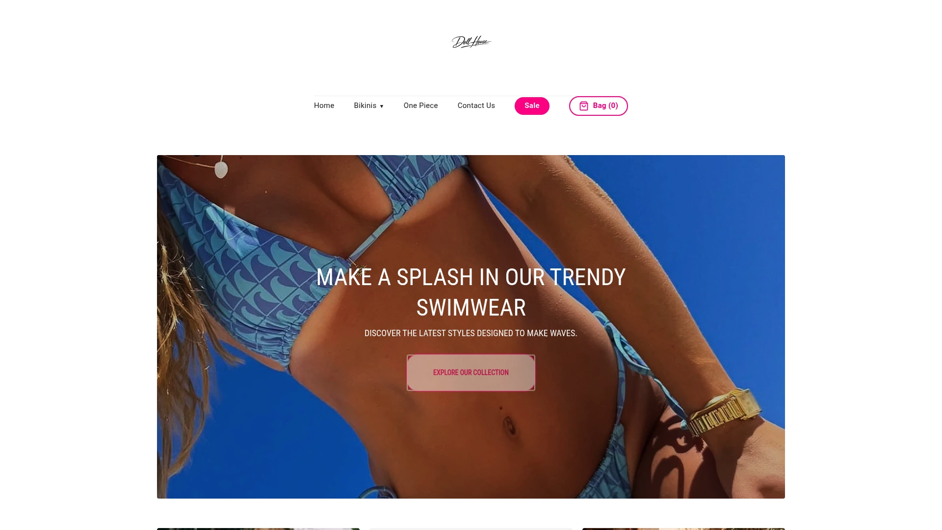
The two-piece swimwear collection covers the full range from solid basics to bold florals, giving you the anchor pieces and the statement pieces in one place. For a complete pool-to-street look, the swimwear coverup options coordinate directly with the bikini range. Orders over $100 ship free. Check the size guide and returns page on Dollhousebikinis before ordering to confirm sizing for each piece independently.
Further reading and sources
- How to Mix & Match Bikinis Like a Pro (MLY Apparel) — covers texture pairing, scale contrast, fabric selection, and the wet/stretch test for compatibility.
- Best Way to Style a Bikini (The Cut) — styling bikini tops as layering pieces, pool-to-street outfit ideas, and waistband construction advice.
- Mix and Match Swimwear Style Guide (Aerie Blog) — neutral anchor advice, capsule-building strategy, and color family guidance.
- Mix-and-Match Swimwear Style Guide 2026 (Dollhousebikinis) — color pairing and balance principles with Doll House product examples.
- How to Mix and Match Bikini Tops and Bottoms (Dollhousebikinis) — practical method guide with sizing and styling advice specific to the Doll House range.
- How to Choose the Perfect Bikini for Your Body Type (Dollhousebikinis) — silhouette-by-body-shape guidance for flattering fit.
- Build Your Bikini Wardrobe: Step-by-Step (Dollhousebikinis) — capsule wardrobe building, from base neutrals to statement pieces.